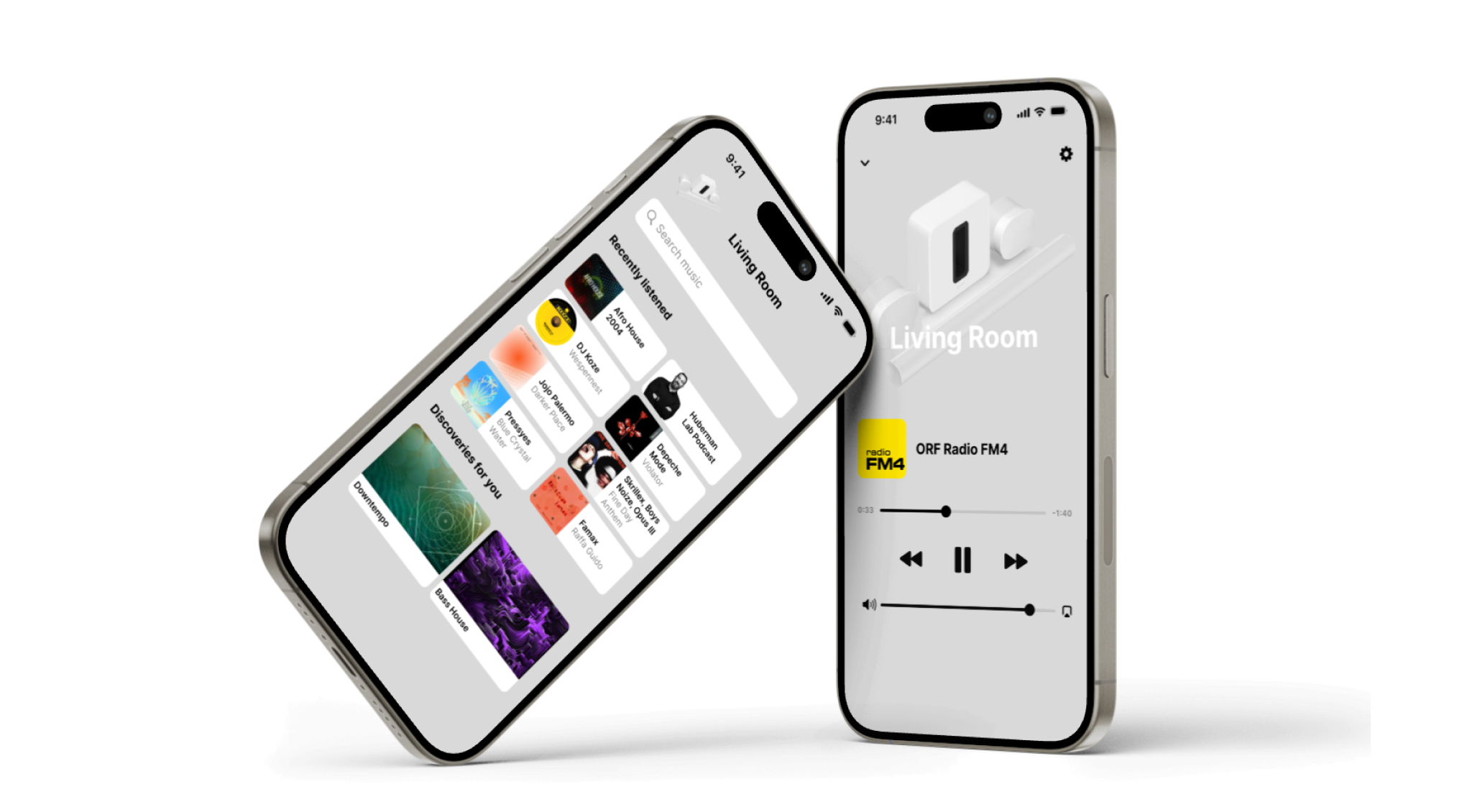
Sonos Control* Enhance your sonic experience with a captivating flow.
As an enthusiastic user of Sonos speakers, I use them every day. I listen to radio, podcasts, or music from a streaming provider or my local music server. For playing and switching music sources, the Sonos app is essential. Through daily use, I have carefully studied the app and thought about improving and simplifying the user experience while maintaining functionality.
Goals
Clarity
Streamlined navigation for seamless music access.
Fast Forward
Swift access to your favorite tunes with fewer steps.
Focus
Elevating music to the forefront of the experience.
Awareness
Emphasizing brand and products.
Solution
Research & Mapping
Understanding the current experience
Analyzing the current screens and their connections to comprehend the app's mental model and the interplay between its sections.

Access
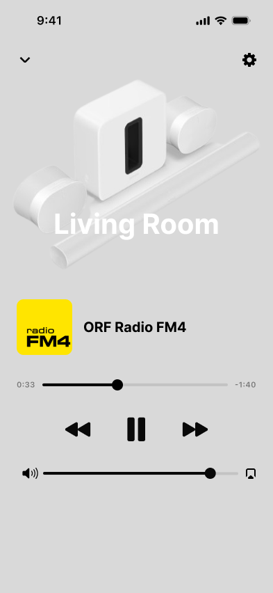
The player is at the center
All essential information and controls are easily accessible. With one click, you can adjust the volume, select the room, or navigate to search for another music source.

Engaging and accessing content
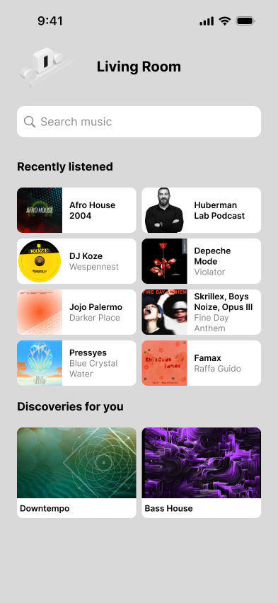
Discovery & Global Search
When I want to change my music source, it shows me recent streams, and I am also surprised with new content. The search provides me with the most suitable results across radios, podcasts, servers, and streaming providers.
At the core
Make the player MVP
By placing the player at the core, all anticipated interactions become easily accessible and predictable.
*Note
This project is fictional and emerged from personal motivation to study, question, and redesign the existing app independently. There is no collaboration with Sonos.
The redesign is based on observations of my own behavior and experiences from my professional background. No user tests were conducted and unfortunately no analytical user data was available for evaluation.
This project was inspired by enjoyment and curiosity, pushing me to test my powers of observation, analytical thinking and design skills.